From corporate hand-me-down to a brand that feels like family for Canadian pet owners.
Petsecure Redesign
Company
Petsecure is Canada's longest-standing pet insurance provider, underwritten by Petline Insurance, a Definity Financial company, and the parent brand for a family of white-label and clone insurance products. Petsecure serves Canadians through direct-to-consumer and B2B channels including vet clinics, breeders, and shelters.
Project Overview
A full rebrand and design system built from scratch, redefining how Canada's longest-running pet insurer shows up for the people who love their pets most.
This project began in July 2025. The brand guidelines were published by November 2025, but work continues on rolling them out across the remaining touchpoints.
Role
Senior Designer @ Petline Insurance
Brand identity, design systems, digital and print collateral, guidelines
Sole designer
Challenge
A 35yo brand that looked like it.
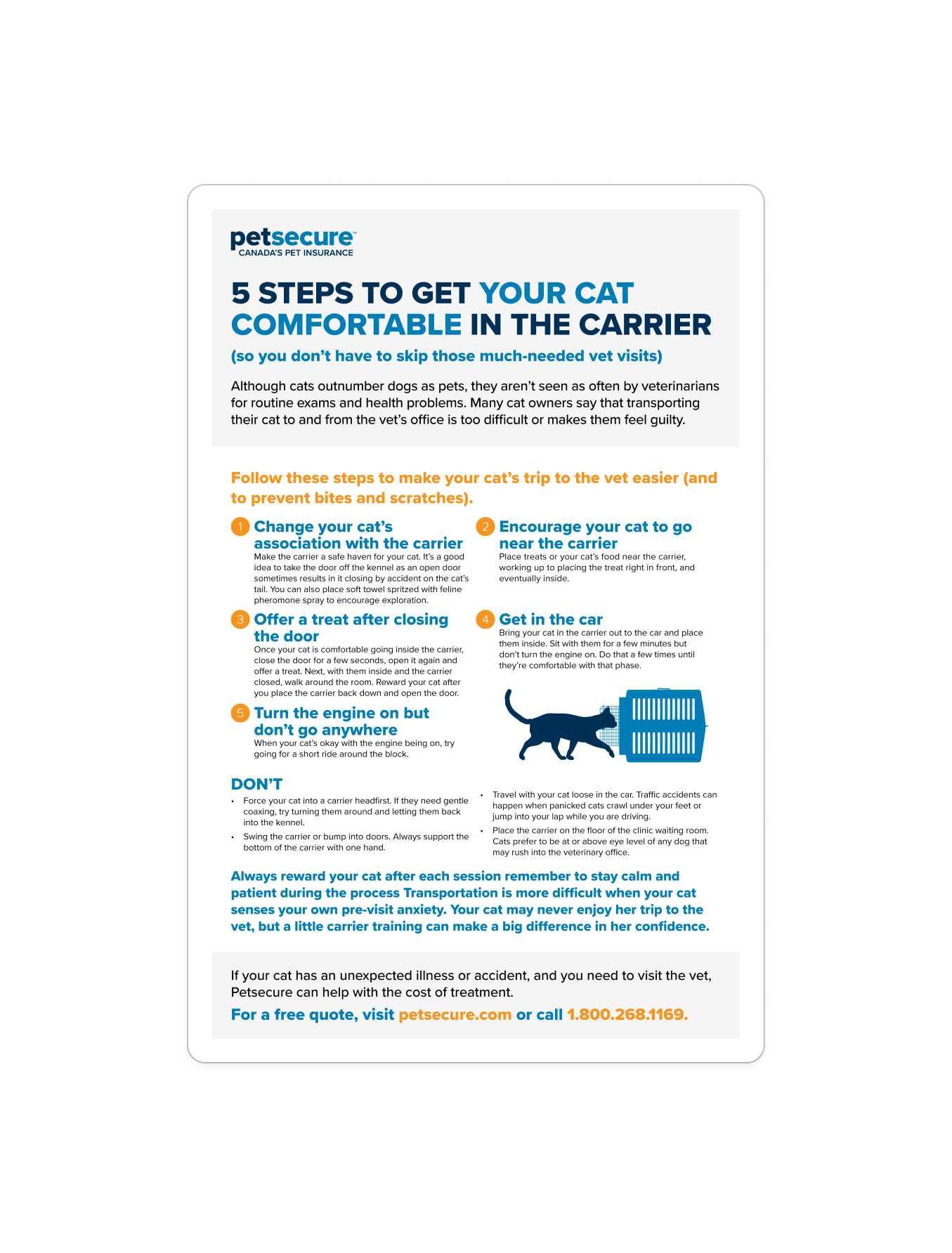
Petsecure inherited its visual identity from Economical Insurance, its century-old corporate parent, a brand built for brokers selling property and liability insurance, not for pet owners who treat their dogs and cats like family members. What I walked into was a brand that could have belonged to any financial services company: a generic blue-and-orange palette, unbranded stock photography with no photographic treatment, and a typeface so widely used it carries no identity of its own.
The brand had been largely unchanged for over three decades. Teams had grown comfortable with what existed and were fearful of change. They didn’t build the design system to speak to pet owners. Remove the logo from any piece, and nothing tells you it was Petsecure.
Before
Rigid blue and orange palette
A generic font with no brand recognition
Unbranded, untreated stock photography
Inherited corporate aesthetic from a corporate brand with different target audience
Canadian identity felt like an afterthought
After
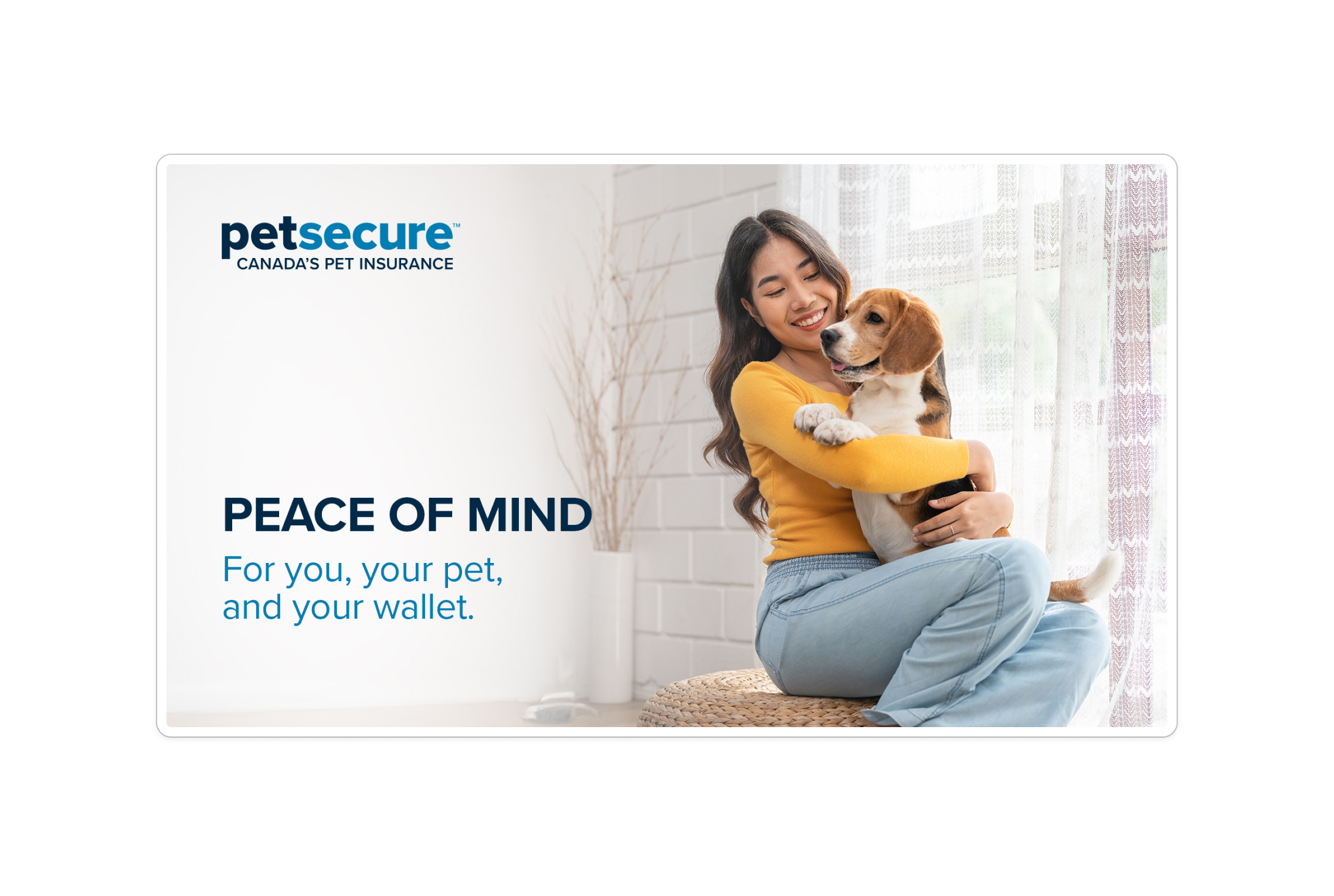
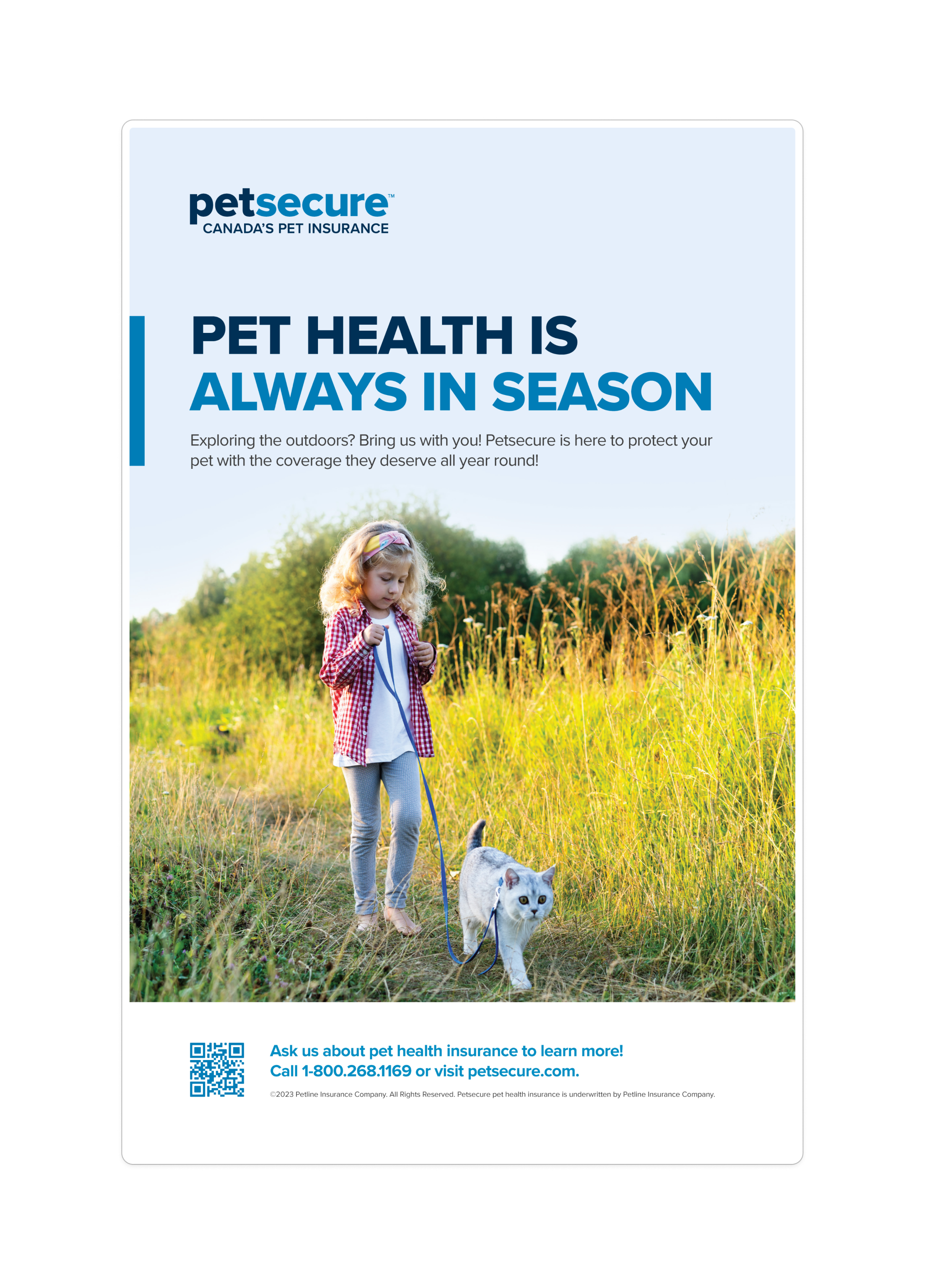
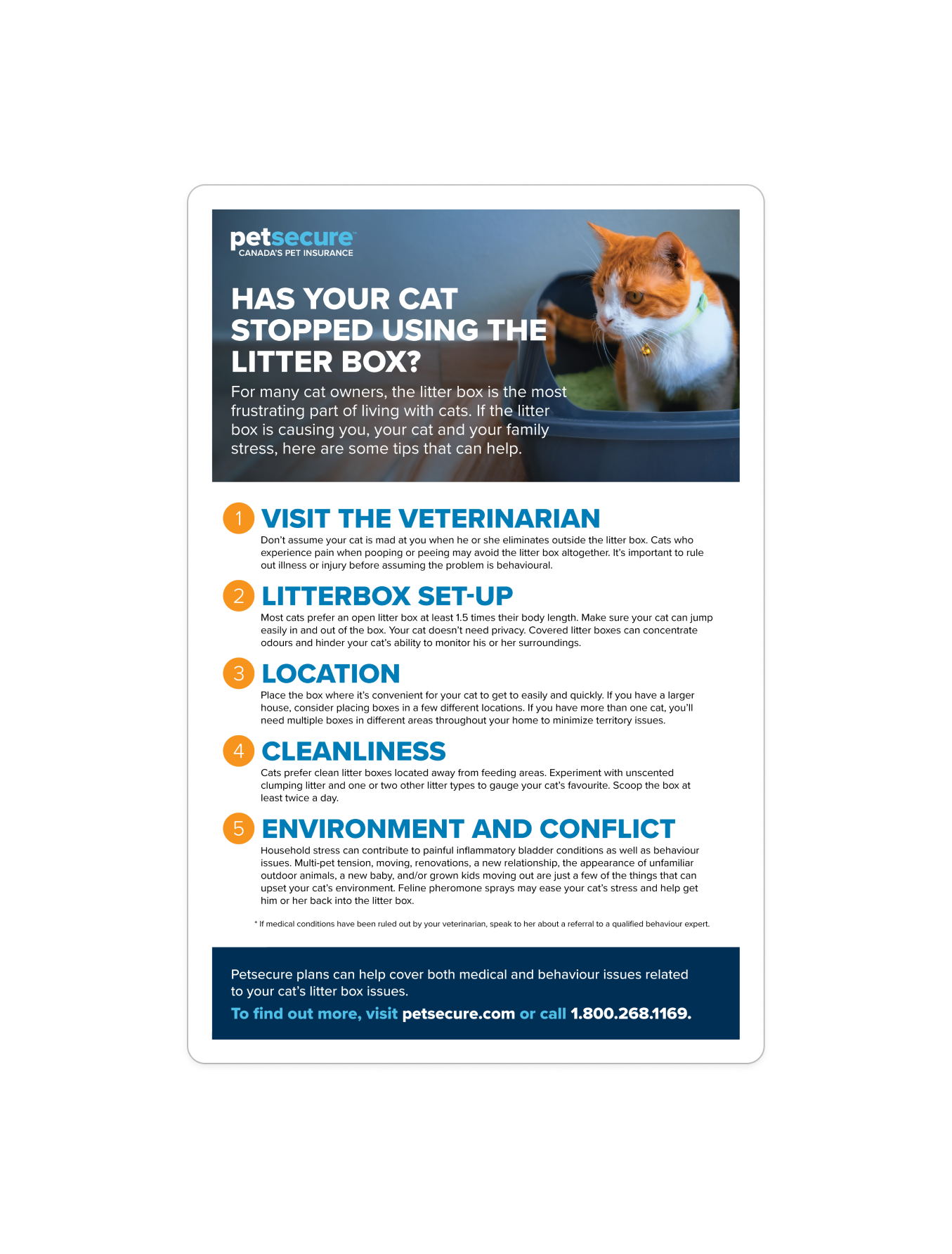
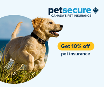
Harmonious blue and yellow palette that feel like a sunny day
A distinctive and open-source font
Photography with consitent brand treatment
Playful shape language inspired by childhood
Canadian identity baked into the logo lockup
Process
1
2
3
4
5
6
How a refresh became an overhaul
What started as a scoped refresh expanded into a full rebrand.
Not because scope crept, but because I felt the brand deserved it.
Inheriting the audit
I joined Petsecure fully aware that the brand needed improvement, as it came up in my interviews. A previous senior designer had created a brand audit in FigJam, compiling the strongest marketing materials from every touchpoint. It provided me with a quick, comprehensive view of the brand. I quickly realized there were no photographic treatments, and the use of Proxima Nova left the brand lacking a distinctive identity. For instance, if I were to remove the logo, nothing would be immediately recognizable. I used that audit to build a clear brief for myself.
Design exploration
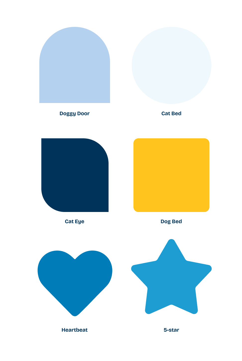
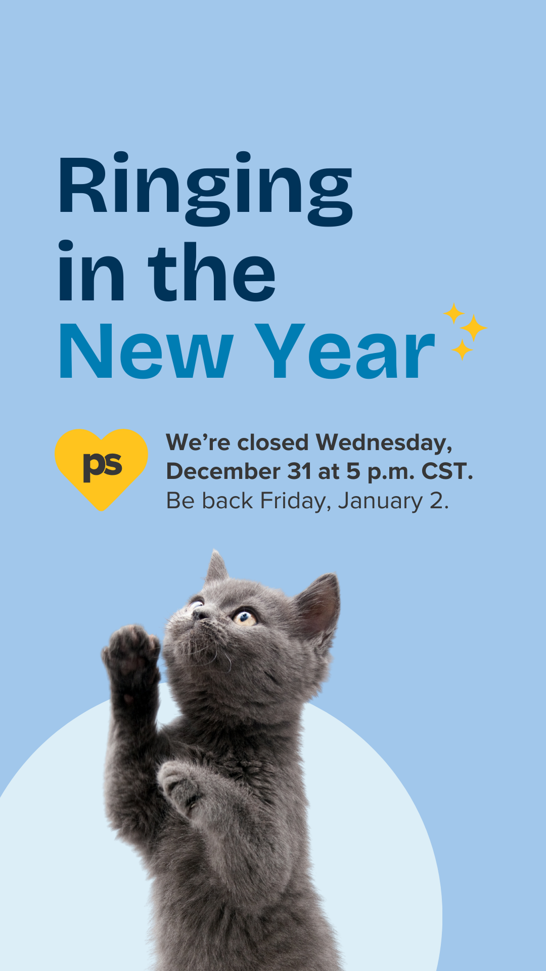
The expectation was to refresh, but I pushed further. I introduced a new typeface, added to the blue family to feel warmer and more alive, and replaced orange with a sunny yellow that felt like the kind of day you'd take your dog to the park. My concept was simple: pet owners treat their pets like children. I designed a shape system drawn directly from that world: the quintessential blocks children play with. The shape system included a circle, an arch, a rounded square, a heart, a star, and what we came to call a cat-eye. I intended to make it playful while remaining easily scalable.
Solving real constraints
Every decision I made had a reason behind it. I chose Bricolage Grotesque because it's open-source, which solves an ongoing licensing problem with Proxima Nova, and because it has distinctive letterforms recognizable as Petsecure even without a logo. Its variable weight range lets me bold a single word or phrase for rhythm and emphasis. I tested every colour combination against WCAG contrast requirements to ensure the playful palette remained accessible across all CTAs. I built the system with a range: expressive and fun for marketing, composed and clear for policy documents and end-of-life communications with pet owners.
Emphasizing the Canadian identity and discovering the “PS” moment
Leadership had long aimed for the brand to better showcase its Canadian roots. A 13-point maple leaf existed, but it always felt like an afterthought dropped onto collateral. I designed a logo lockup that integrates the leaf into the brand, making it appear as part of the identity rather than an addition elsewhere. Instantly, the brand communicated that it was a Canadian pet insurance provider. I also designed a simplified icon, a PS monogram for small-use contexts like favicons and social profile images. What I didn’t expect was that PS could turn into a copywriting tool: "PS, your pet would pick Petsecure." By developing the visual system, I unintentionally gave the team a new brand voice.
Presenting to leadership
I presented the work twice and made deliberate choices about how to frame it each time. At the director level, I walked stakeholders through the Figma board directly to show my thought process. At the VP level, I prepared a formal deck. I translated the design thinking into business language: brand differentiation, the Canadian positioning opportunity, accessibility compliance, and how the system would scale across Petsecure’s marketing. I answered the questions I knew they'd have before they asked them. Both sessions ended with near-unanimous approval and almost no revision notes. Leadership had been saying for years that the brand needed more fun, and I showed them what that actually looked like.
Rolling out the system
With approval secured, I focused on rebranding the digital channels: social, website, and Meta ads, while an intermediate designer handled the refresh of print collateral. We ran this in parallel with all BAU design work across the company. I partnered with the communications specialist to formalize the brand guidelines, who translated my visual decisions into written language, and published the complete document to SharePoint for distribution across all Definity Financial brands by November 2025.
Design system
Every element has a name and a reason.
Names in the system aren't just labels: they reinforce the brand's personality at every level.
Colours and shapes are named the way a pet owner would talk, not the way a brand manager would file.
Branding
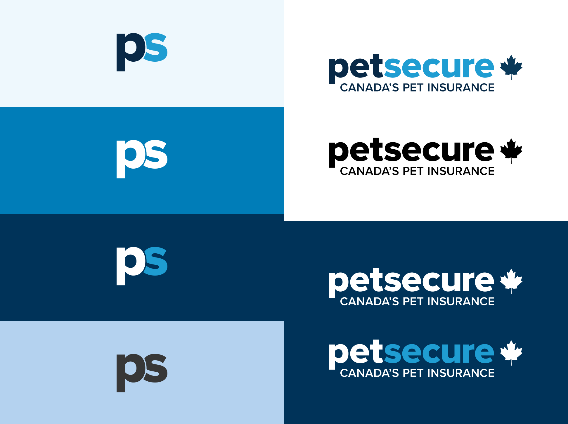
Logo lockup + PS Icon
I created two additions to the existing wordmark:
A lockup that integrates the 13-point maple leaf as a structural element, not decoration, so the Canadian identity is built in and not an afterthought elsewhere.
A PS monogram icon for small-use contexts (favicon, social profiles) that doubles as a brand voice device: "PS, your pet would pick Petsecure."
Typography
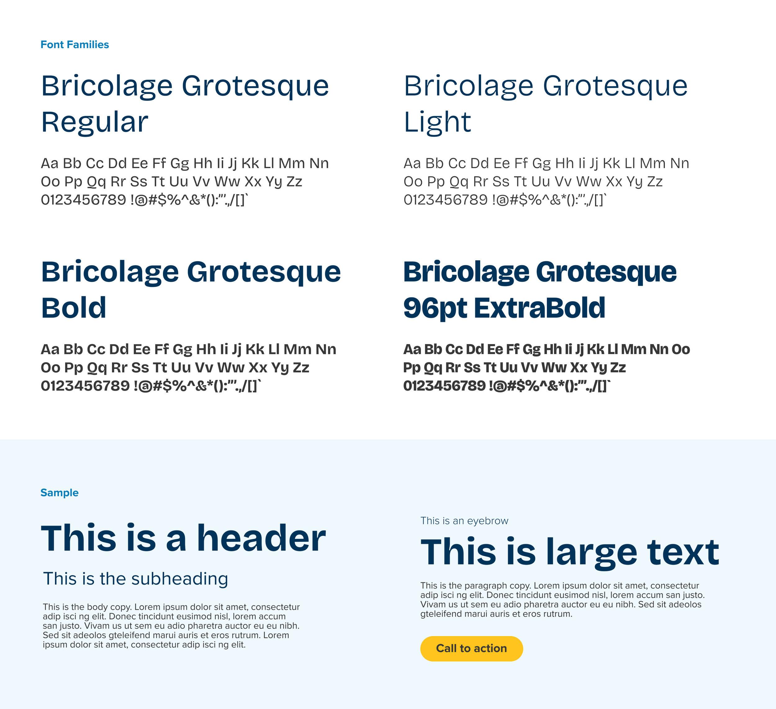
Bricolage Grotesque
I selected this typeface because it is open-source, addressing the issue of licensing costs. Its letterforms are instantly recognizable, and it offers variable weights, allowing us to use bold text for emphasis.
Its use is limited to marketing purposes and is controlled by our designers, as we didn’t need it in legal or policy documents.
Colours
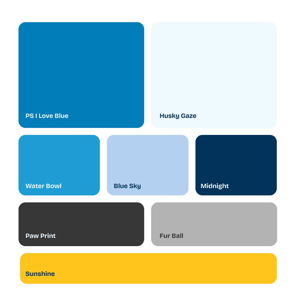
Representing a sunny day
The original blue-and-orange palette created stark, high-contrast tension that felt more corporate warning sign than pet brand. I introduced Sunshine, a bright and clear yellow, because it reads as a natural companion to blue: harmonious, outdoor, and emotionally lighter. I also brought in a new blue that completed the harmonious blues. The full palette became a visual shorthand for a clear day in the park with your dog or the bright sunny day that cats bask in.
I named the colours to truly convey these feelings.
Shape system
Reflecting how we treat our pets like family
The shapes don't just frame images; they create a visual relationship with the animal inside them. I built the treatment so that every animal either fits snugly into its shape or breaks through its edge in a way that feels intentional. This gives every piece of collateral a visual logic that's recognizable as PetSecure even before a logo appears. The shape is not decoration. It's part of the story.
I named the shapes to reflect where cats and dogs fit into a pet owner’s life.
Leadership Alignment
I made a deliberate choice to present differently to each level of leadership. At director level, I presented live in Figma, walking through my rationale. At the VP level, I built a formal deck and reframed every design decision through a business lens: differentiation, the Canadian identity opportunity, accessibility compliance, and scalability across Petsecure’s marketing. I structured the presentation to pre-empt the questions I knew would come. Both sessions resulted in near-unanimous sign-off with minimal notes. What made it land wasn't just the visual quality; it was that the work answered something leadership had been trying to articulate for years without being able to picture it.
-
Live Figma walkthrough to explain design in context
-
Formal deck that related the system back to brand strategy and positioning with business rationale

FINAL PRODUCT
A brand that finally looks like the company it is.
In five months, while running BAU design across all channels simultaneously, I designed, aligned, and shipped a complete brand system.
The official document was published on our SharePoint site and distributed across all Definity Financial brands (Sonnet, Family Insurance, Economical Insurance) by November 2025. The system continues to roll out across print collateral and remaining digital touchpoints.
5 Months
From concept to published brand guidelines
35 Years
Brand age, with this project being the first major overhaul
1 Designer
I owned the build and design of the full system from end-to-end
3+ Channels
The rebrand is now live on social, website, and meta ads
Impact


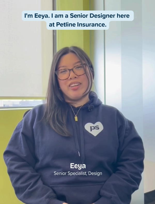

Featured on socials with the PS hoodie I designed
“Your thoughtful approach to the visual identity and your ability to quickly ramp up have made a real impact.”
“A big thank you to Eeya for jumping in with such energy and creativity on the Petsecure brand work. Your thoughtful approach to the visual identity and your ability to quickly ramp up have made a real impact. The work you’ve done so far lays a strong foundation for where we can take the brand next. More to come, but we’re excited about the direction and grateful for your contributions!”
Catherine B., Definity Financial