A mobile wallet app that allows users to track their use of funds, lock their card, and use their rewards.
Tru Wallet
Company
TruCash Group of Companies (dba Tru Inc.) is a B2B Fintech/Payments company that provides digital wallets, Prepaid Credit Cards (CA) and Debit Cards (US).
Project Overview
The TruWallet app allows users with reloadable cards to access their funds on their phones. The app can have generic Tru Inc. branding or be white-labelled.
This project began in February 2022 and launched on App Store and Play Store in December 2022.
Role
Senior Product Designer @ Tru Inc.
User Research, Information Architecture, Wireframing, UI Design, Prototyping, Usability Testing
Sole designer working alongside 1 Mobile Developer


Challenge
POOR NAVIGATION
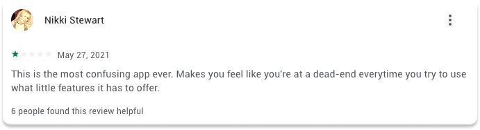
Many users took to App Store and Play Store reviews to voice their frustrations with the app. Some stated how difficult it was to navigate and that they frequently found themselves in dead ends.

“Hard to navigate and options were very deceiving.”
Stakeholders also noted that users never used the extra Shop & Earn feature. It needed to be more prominent as it seemed hidden or unclear.
User Surveys
To begin, a questionnaire was sent to TruWallet app users and also users of other wallet apps (Apple Pay, PayPal, Venmo, Cashapp, etc.) to determine what their experiences are with wallet apps in general.


Demographics
Of the 23 responders:
9 were women
14 were men
Age range of 20-40
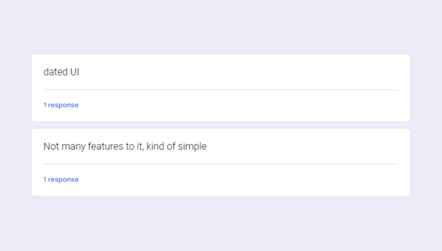
What did they not like about the app or wallet apps in general?
Most users made similar complaints. Some cited dated UI and others cited that it was ‘kind of simple’.
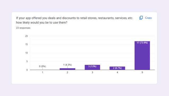
Were users interested in in-app deals and promotions? Would they even use them?
I was excited to learn that users were not only interested in having discounts, 73.9% of users stated they were very likely to use this feature. This aligned perfectly with stakeholder goals of promoting the ‘Shop & Earn’ feature.
Wireframes

Option 1
Makes it easier for users with multiple cards
Promotions readily accessible
Doesn’t have card balance in header
Very few clients have a need for multiple cards
Cards are moving to a vertical format
Option 2
All 3 balances in header
Cardholder name and balance very prominent
Name covers card artwork
Feels less personal
Feels forced having promotions before transactions

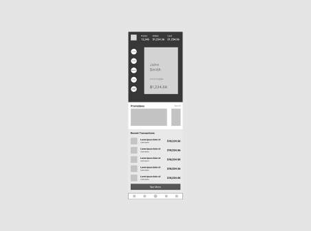
Option 3
Includes personal greeting
All 3 balances in header
Card artwork is very prominent
Balances prominent in multiple places
Transactions available before promotions
WE CHOSE OPTION 3
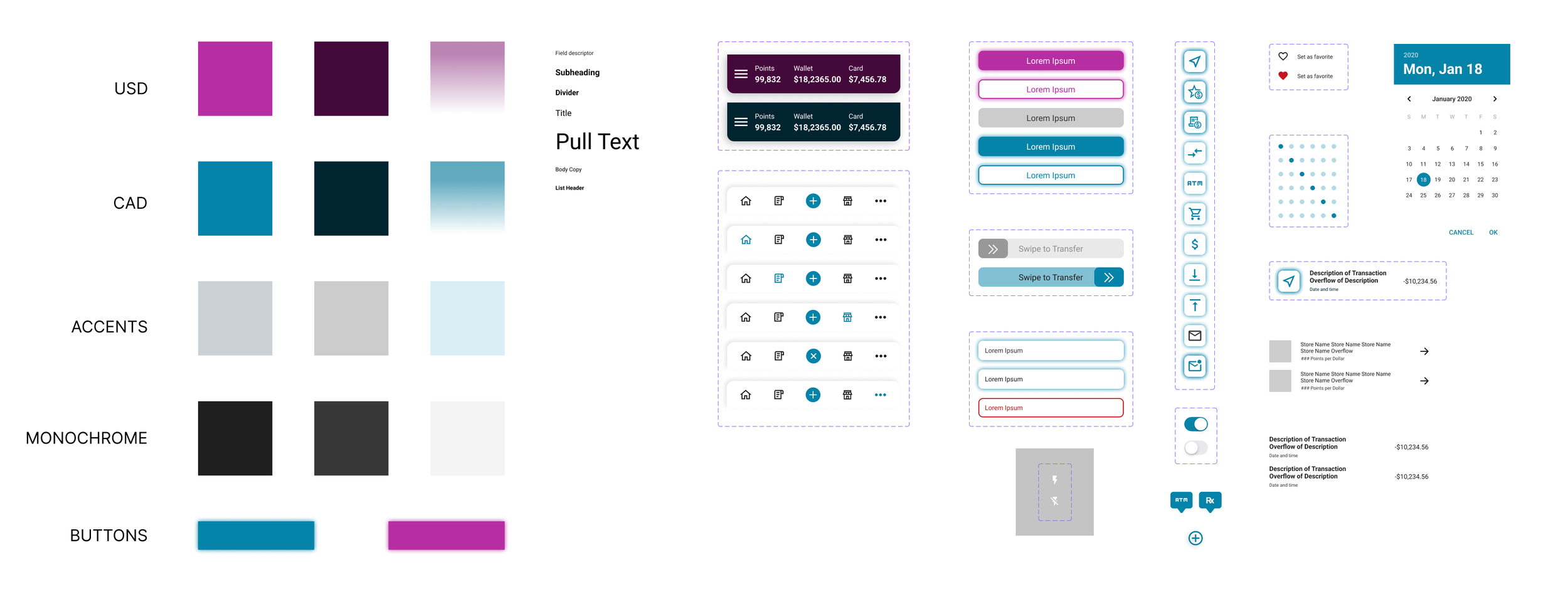
Design Systems
Tru was going through a rebrand. The colours PINK and BLUE mimicked futuristic colourways and was the direction we were heading into.
To differentiate between USD cardholders and CAD cardholders, there were separate colour guides for each version.
The iconography was based on Google Material icons and matched their icon line weight to have a consistent icon styling. These icons needed to be descriptive enough that users would be able to intuitively navigate through the app.
Some icons, like Redeem Points, I created custom through Figma using Shape Tools.
High-Fidelity Designs
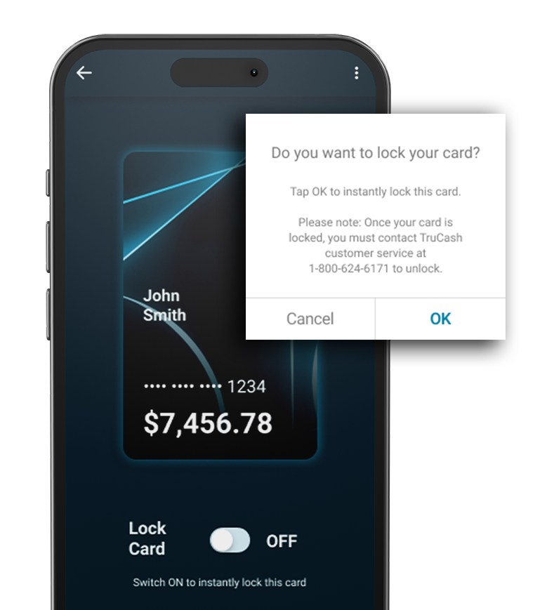
HOME SCREEN
Although the layout was approved at the wireframe stage, the featured Card Art underwent multiple rounds of feedback and revision. Design-by-committee can be challenging, but we ultimately achieved alignment by prioritizing business objectives in our discussions.
Stakeholders were especially drawn to the neon glow effect around the card. Once we discovered we could seamlessly incorporate this glow into the artwork, it sparked excitement and consensus across the team.
SHOP & EARN
Previously, the Shop & Earn feature led to a confusing, hard-to-navigate portal. In this updated version, the feature is integrated directly into the app, allowing users to “Favourite” preferred stores. Clicking on a store reveals detailed information, including the potential points users can earn by shopping there.
When users click “Shop Now,” a notification confirms that they’re ready to start earning points, and a new window opens within the app to keep users engaged and assure them that their transaction will be tracked. If a user attempts to exit the shop, they’re prompted with an option to stay, in case the exit was accidental. Additionally, a timeline for receiving points is provided to set clear expectations and reduce cardholder anxiety.
Shipping
CONNECT WITH MOBILE DEVELOPER
DEADLINE
FOUNDATION
BUILD-OUT
TROUBLESHOOTING
BACK-END DEVELOPERS
I connected via Zoom and Slack with our mobile developer in Texas to coordinate how this would be built. I made sure to involve him through every checkpoint in the design process to not only allow him the opportunity to share his expertise, but also so he could prepare for how best this would be built.
Stakeholders were anxious to launch and gave us a short deadline of 3 weeks after the prototype was approved for the developer to build this out.
There were a lot of tokens making API calls, and instead of a complete build from the ground up, we decided it was best for the developer to work off the previous code and make changes to the interface.
With every version the developer provided, there was rigorous testing to make sure the MVP matched the Figma designs. There were dozens of rounds with USD and CAD cards before it met our standards.
At the same time, we found issues with the app connecting to the server. Receiving tokens, updating card transactions, speed in which money was being transferred between accounts.
As the lead on this project, I connected with our back-end development team to clear out all issues with APIs.
Usability Testing
The first User Test versions came out in APK for Android and on TestFlight for iOS with resounding success.
Users understood how to navigate the app and didn’t get lost or confused when trying to perform specific actions.
There were no more clunky animations like the previous versions so users perceived it loaded faster.

FINAL PRODUCT
The app launched on App Store and Play Store in December 2022.
Since launch, the rating on App Store went up 160%.
It has been white-labelled for many other clients like: United Way British Columbia and Mobile Klinik, and simplified into a TruBalance app (for one time use prepaid/debit cards).