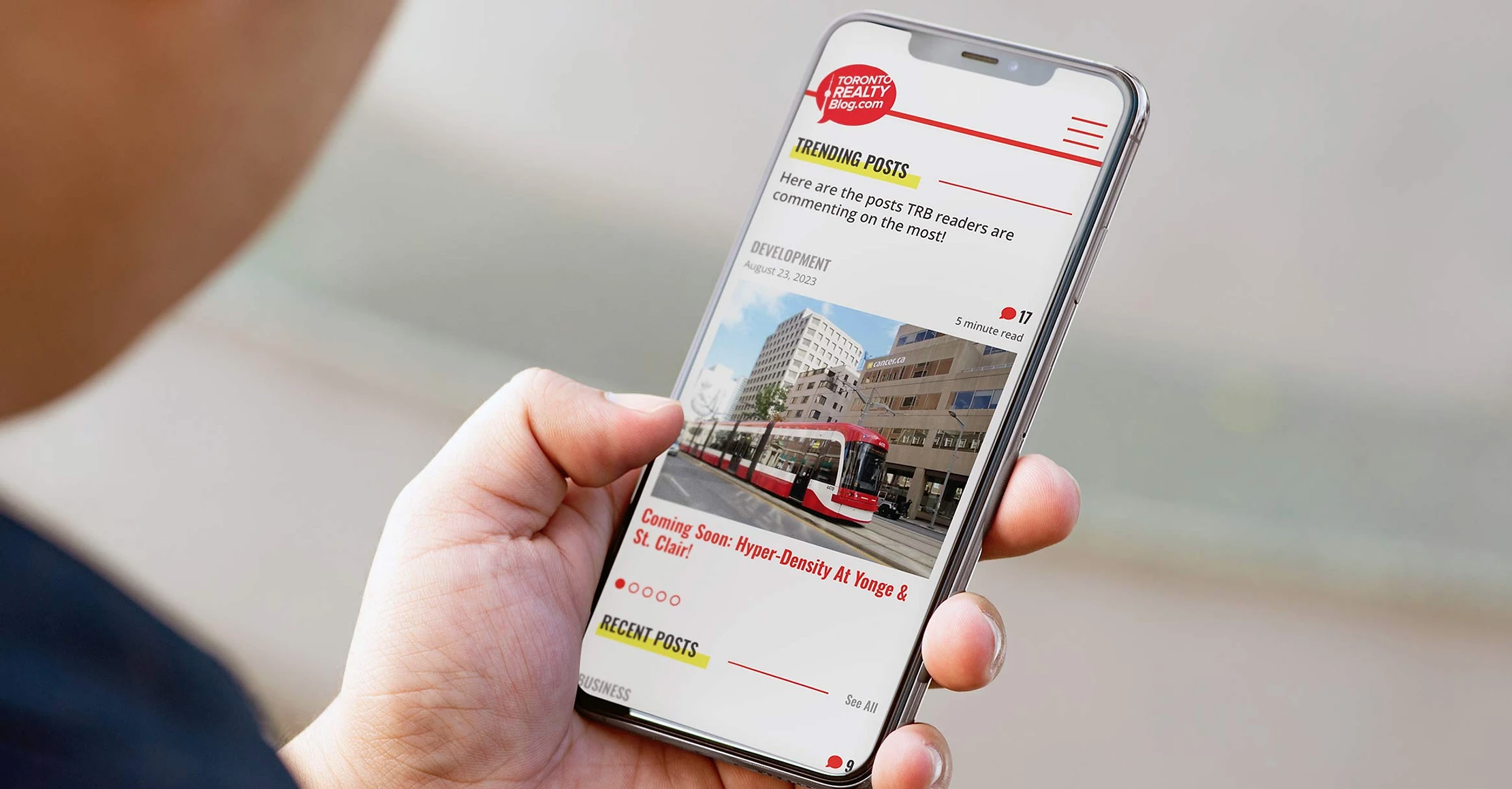
A prominent blog with an average of 27,000 monthly visitors for all things Toronto Real Estate
Toronto Realty Blog

Project Overview
A logo refresh and WordPress website redesign.
Role
Marketing & Design Manager @ Bosley - Toronto Realty Group
Information Architecture, UI Design, Logo Design
Sole designer working alongside an agency for WordPress development


Logo Evolution
2007: The original style featured a busy treatment and the blog author’s name in an unclear typeface.
2015: The second version of the logo had a thin border that did not scale well when used in smaller formats. It was also clear that the CN Tower outline did not connect seamlessly to the edge of the speech bubble.
2023: The final version was a seamless and minimalistic design that did not stray too far away from the original so that when the website redesign was published, readers would not have to adjust to too many abrupt changes. This version also allowed the possibility of a logo in a negative or all-white format, seen in the next section below.
Website
From analyzing Google Analytics, we were able to simplify the navigation from 8 options to 6 and removed many features that were left unused for years.
It was very monochromatic so a small highlight in a contrasting colour was added to subheadings and call-outs as a way to continuously draw the eye. Red is a very strong colour, so yellow was picked to complement it.
There are also now more prominent CTAs to promote Pick5, the weekly show that compares 5 related Toronto properties as views were declining but readership improved. We needed a way to bridge the gap and we began to get more signups.
Small touches like a fixed header and a more organized comment section were included.


FINAL PRODUCT
I designed the site on Figma and liaised with an agency for WordPress development. It is now hosted on WPEngine to increase bandwidth. The site launched on October 2023.